The idea
A reason to come back tomorrow.
Publications live or die on return visits. A daily puzzle is the cheapest habit loop in media: small, finishable, and over by tomorrow, which is exactly when the next one appears.
The Sentinel publishes strong stories, but stories do not create a daily appointment on their own. The site needed something readers would open every morning before they knew what the day's stories were.
A game, treated as a brand touchpoint. Seen every day, it should feel unmistakably Yuvoice, not a generic word game with a logo on top. That framing drove every decision below, and it earned the game its own category in the site's navigation.
Feature 01 · The hook
The brand is the mechanic.
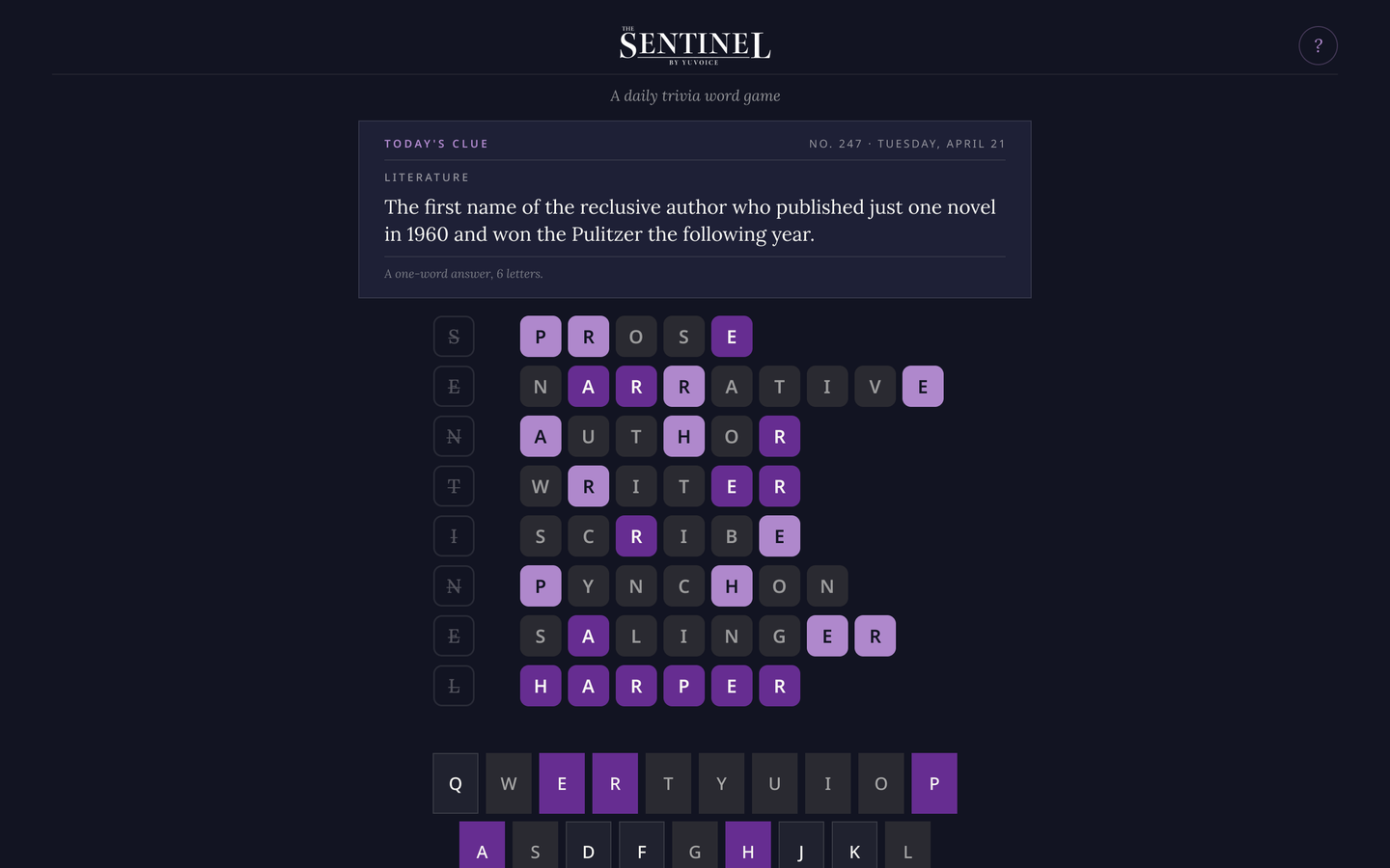
Every day, one new clue. A numbered, dated puzzle with a single word answer and letter-by-letter feedback.
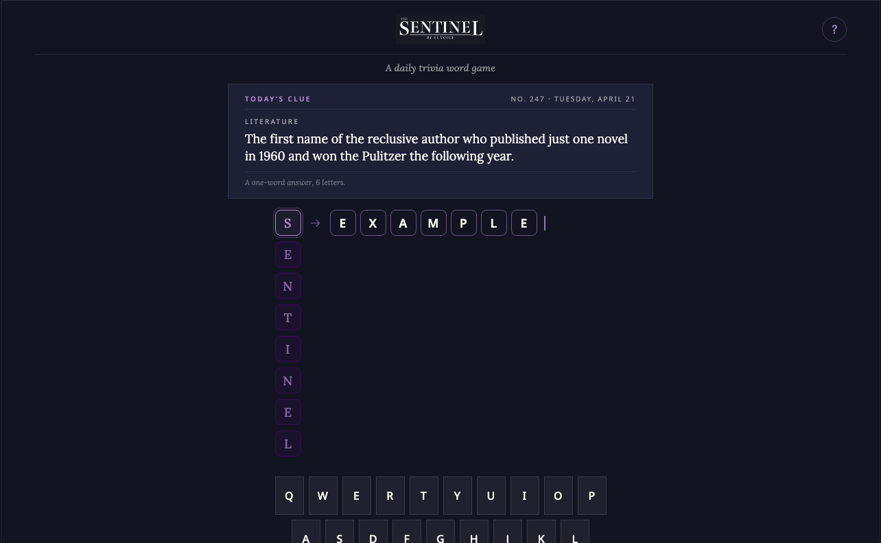
Eight guesses, spelled S-E-N-T-I-N-E-L. The brand name is the guess counter. Each row is a letter of the name, so the identity is part of play rather than a logo in the corner.
You do not know how long the answer is. Answers run four to nine letters, and the board does not tell you which. It is the deliberate departure from Wordle's fixed five-letter grid: the clue carries the game, not the shape of the boxes.
Trivia, not vocabulary. A category and a clue, written like a newsroom would write it. Knowing things beats knowing words, which is the right test for a publication's readers.
Feature 02 · Direction
Making it feel like Yuvoice.
The first working version looked like every other word game: green and yellow tiles, a bold sans wordmark, a plain clue box. It worked, and it belonged to nobody.
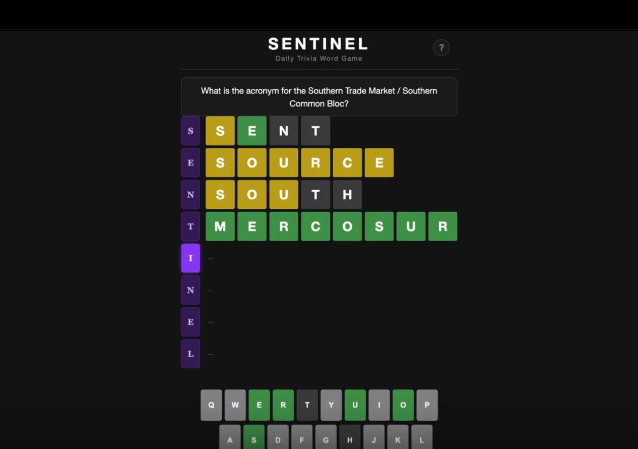
Wordle green. Borrowed feedback colors mean borrowed identity. The game owns the house purple instead, with lavender for near-misses, and the tiles now read as Yuvoice's before you read a letter.
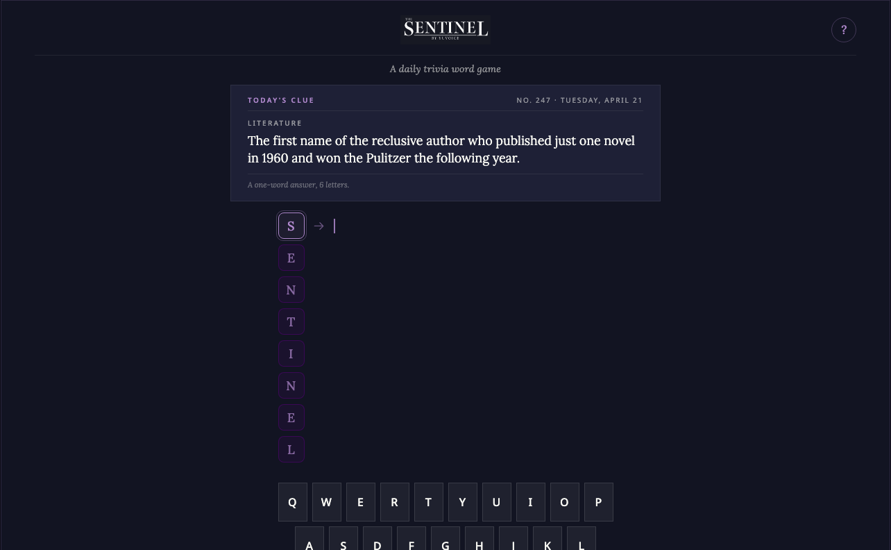
An editorial masthead. The serif wordmark echoes the newspaper's identity, and the clue sits in a bordered panel with a category kicker, like a column, not a pop-up.
A calmer, grown-up voice. Understated and confident rather than loud and gamey. "No edition today" instead of a sad-face error. The product is a newspaper that happens to have a puzzle, and it talks like one.
Feature 03 · The system
Every state, every theme, every screen.
A daily game is seen on its best day and its emptiest. I designed the full set: how to play, start, mid-game, win, loss, no puzzle, light and dark, desktop and mobile.
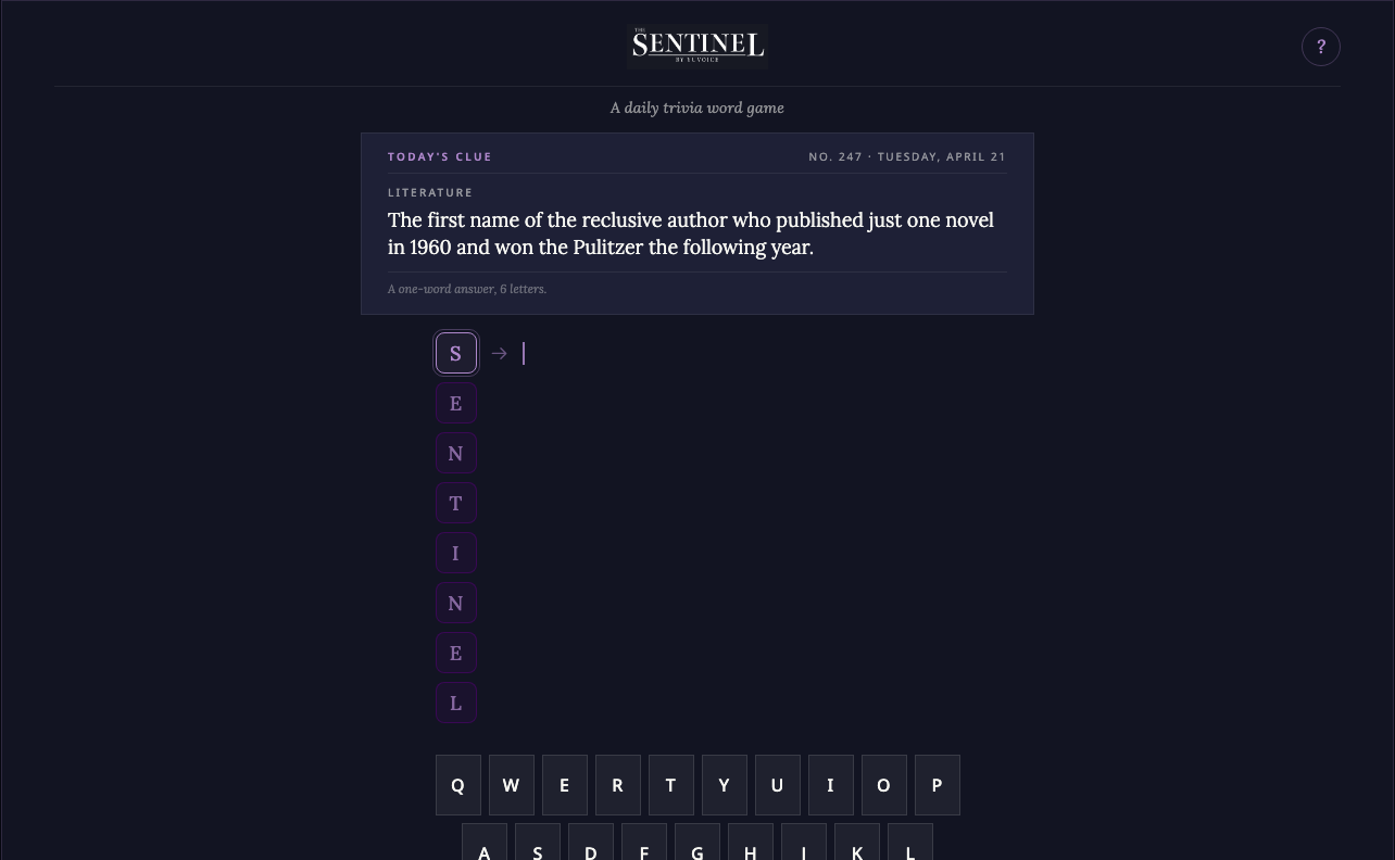
The clue and an empty board. The cursor waits in the first row; the eight letters set the stakes.
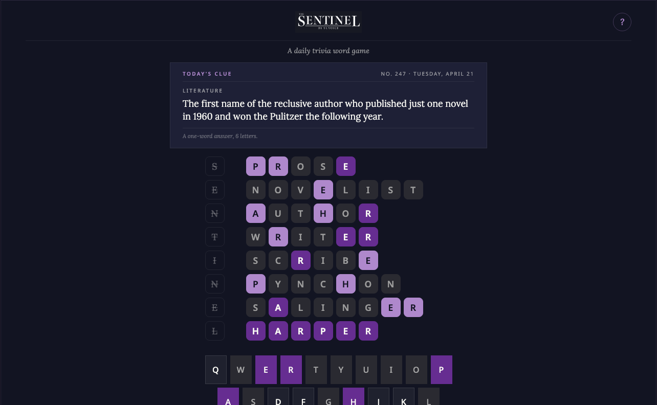
All eight rows used, the final row lights up. The keyboard carries the full history of what was ruled out.
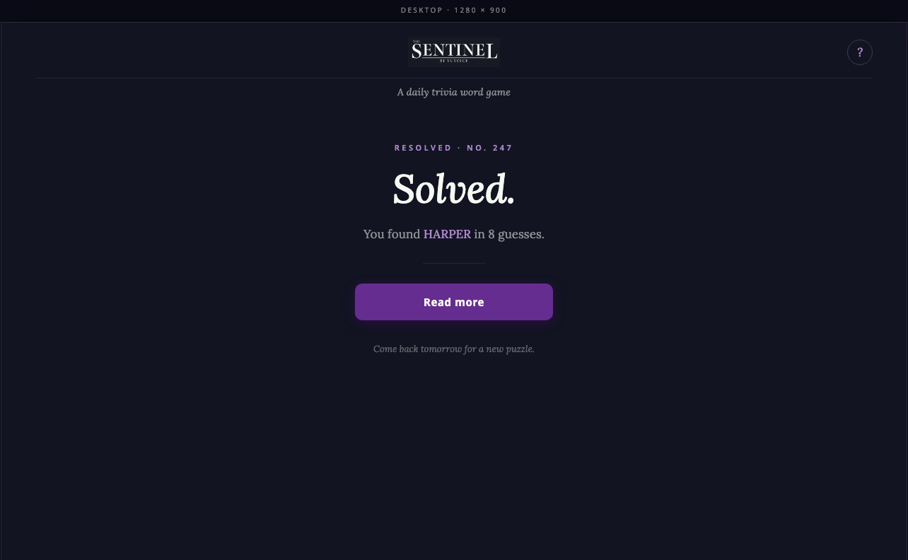
"Solved." in the editorial serif, the answer named, and a single next step: read today's stories. The game hands you back to the publication.
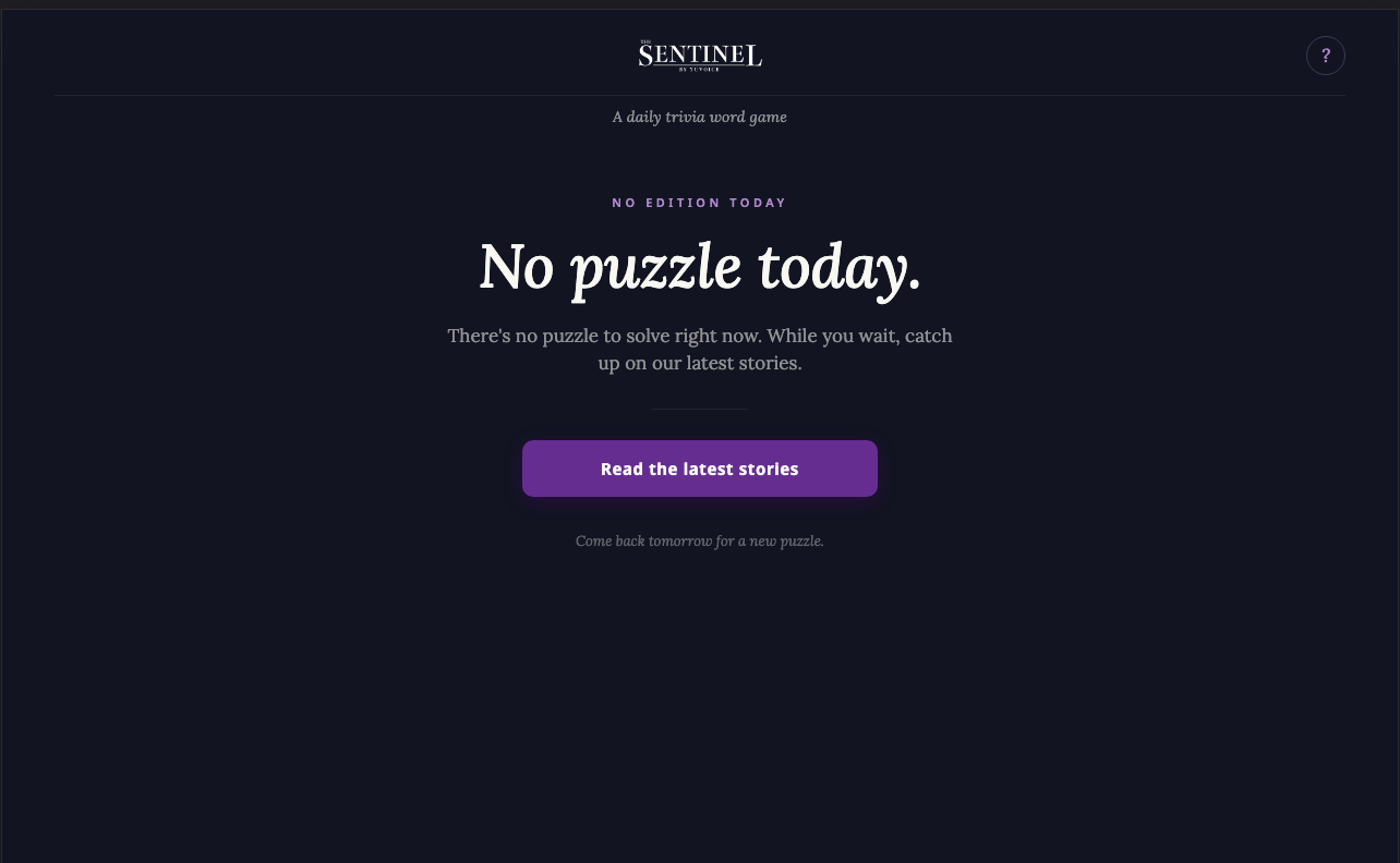
"No edition today." No error, no apology, a pointer to the latest stories, and a promise to come back tomorrow.
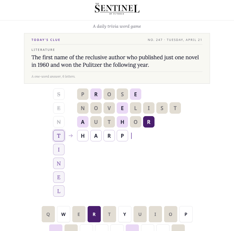
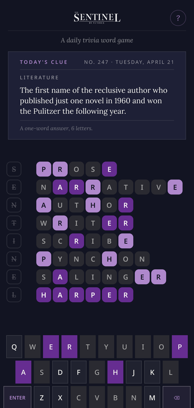
Light mode is designed, not inverted. The light theme uses a warm cream keyboard and clue panel so the board still has weight; a straight inversion would have left the whole thing floating on white.
Feature 04 · Proof
Play it.
This is the working prototype, not a mockup: type a guess, use the keyboard, watch the feedback. Built in React with the brand's own color tokens.
Outcomes
What exists, and what it proves.
- A complete, playable game. Board, keyboard, feedback logic, invalid-guess shake, result overlays, and the how-to-play screen, all running.
- A full state system. Start, mid-game, win, loss, no puzzle, light and dark, desktop and mobile. Nothing left as "we'll figure it out."
- A brand touchpoint, not a bolt-on. The game earned its own "Games" category in The Sentinel's navigation, which means the habit loop is a first-class part of the publication.
- Not live yet. This is a working prototype. It has not been played by readers, and the puzzle content is demo content.
Design the daily return, and the design system comes along for free: every state, both themes, every screen.
The short versionWhat I would do differently
Put it in front of players before polishing the states. The unknown-answer-length rule is the game's best idea and its biggest risk; a week of real players would tell me whether it feels clever or unfair, and that answer should shape the difficulty curve before anything else does.
Design the keyboard for thumbs first. The desktop board came first and mobile followed; for a game people will mostly play on a phone in the morning, that order should have been reversed.