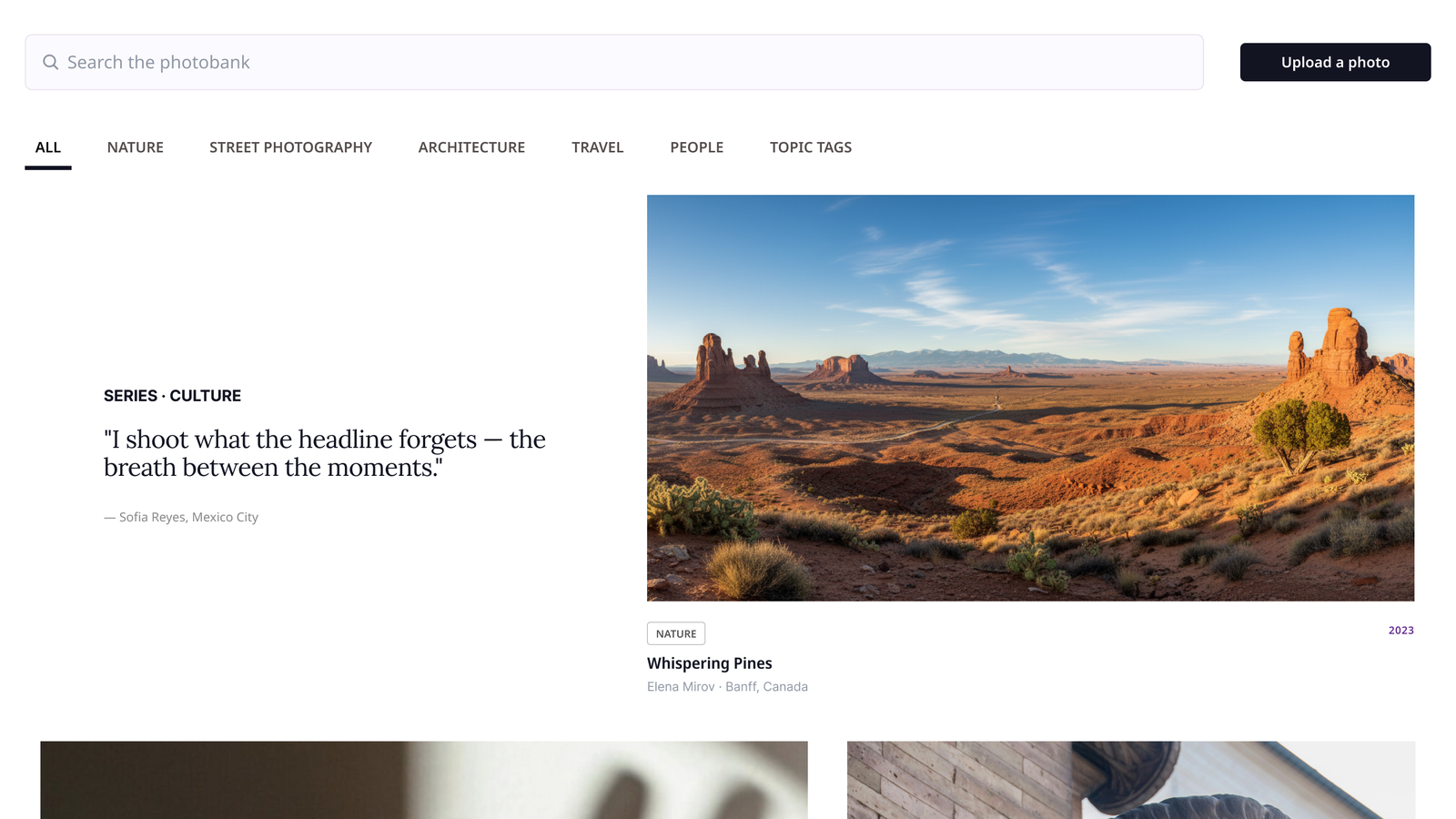
The brief
Two goals in tension.
An internal tool with a magazine's standards. Editors source photos for stories under deadline. Stakeholders wanted the experience to feel as considered as the stories it supports.
Practicality and visual appeal pulled against each other. A denser grid let editors scan dozens of options in seconds but felt like a file browser. More space and bigger images felt editorial but slowed the scan. The job was not to pick a side. It was to find the middle.
I designed alongside The Sentinel's team. The density exploration on this page, the sessions with editors, and the responsive layout are where I spent my time, and the final grid is the version the editors chose.
Feature 01 · Direction
Let the photography lead.
Stakeholders kept describing a feeling they could not name. I went looking for it and found two editorial references that captured it: photography as the hero, room to breathe, and a clear hierarchy. One light and calm, one dark and bold.
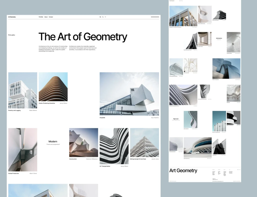
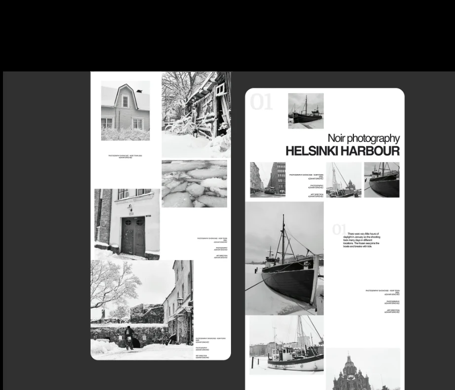
References before pixels. Putting two real pages in front of stakeholders turned "make it feel more visual" into something we could point at and agree on. The direction was settled in one conversation instead of three rounds of guessing.
Feature 02 · Iteration
From dense to balanced.
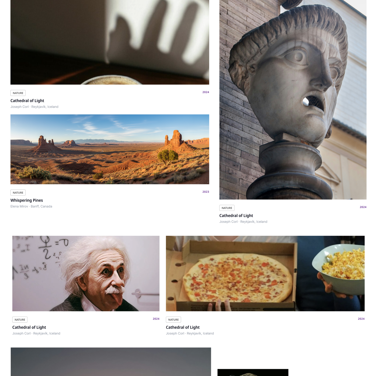
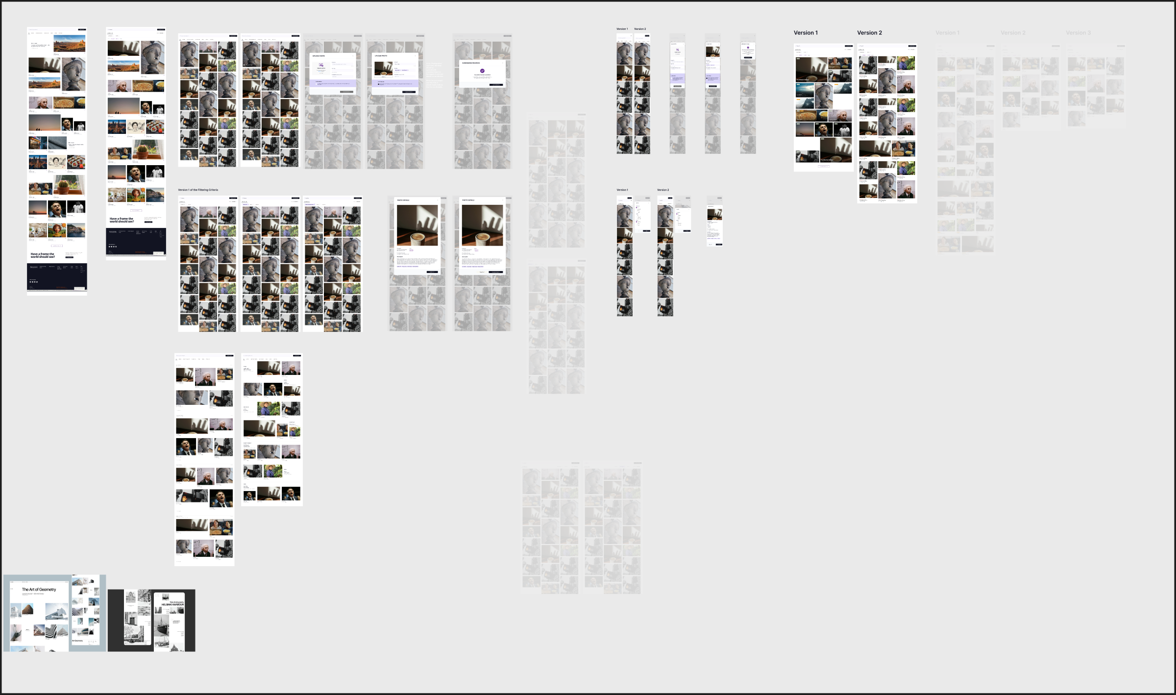
Four versions, read left to right: maximum density, the whitespace swing, a tighter middle, and the final. The swing was the most useful mistake in the project.
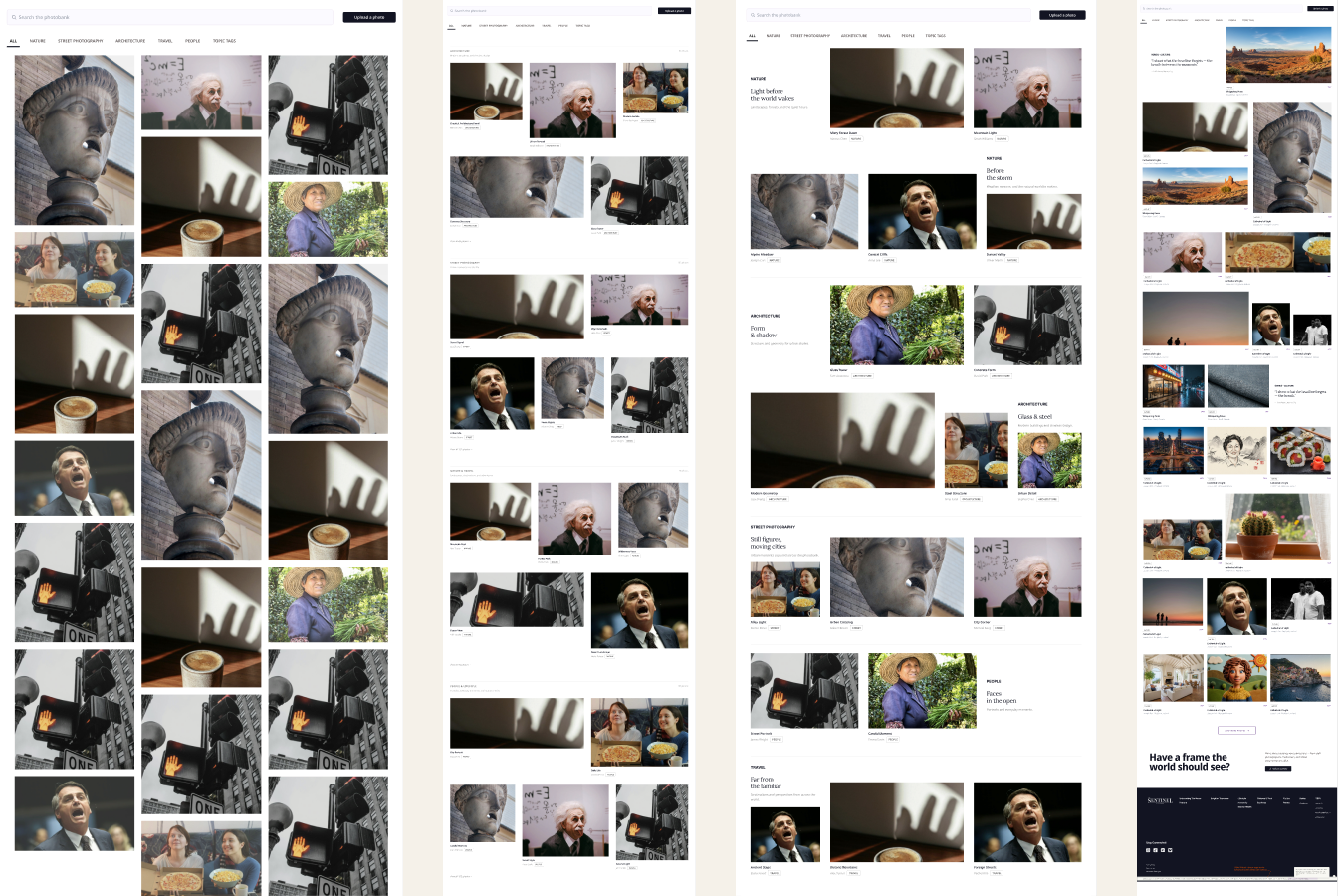
A dense, efficient grid. Version one packed in as many photos as possible. Practical, and flat. It scanned fast and felt like nothing, which was not the experience stakeholders were after.
Too much of a good thing. I pushed hard toward the references: bigger images, generous spacing, photos grouped by category. It looked beautiful, and editors lost scanning speed. That surfaced the real problem: every gain in visual polish cost practical density.
More structure, still heavy. Spacing came in, categories stayed, hierarchy got clearer. Closer, but the scan still dragged.
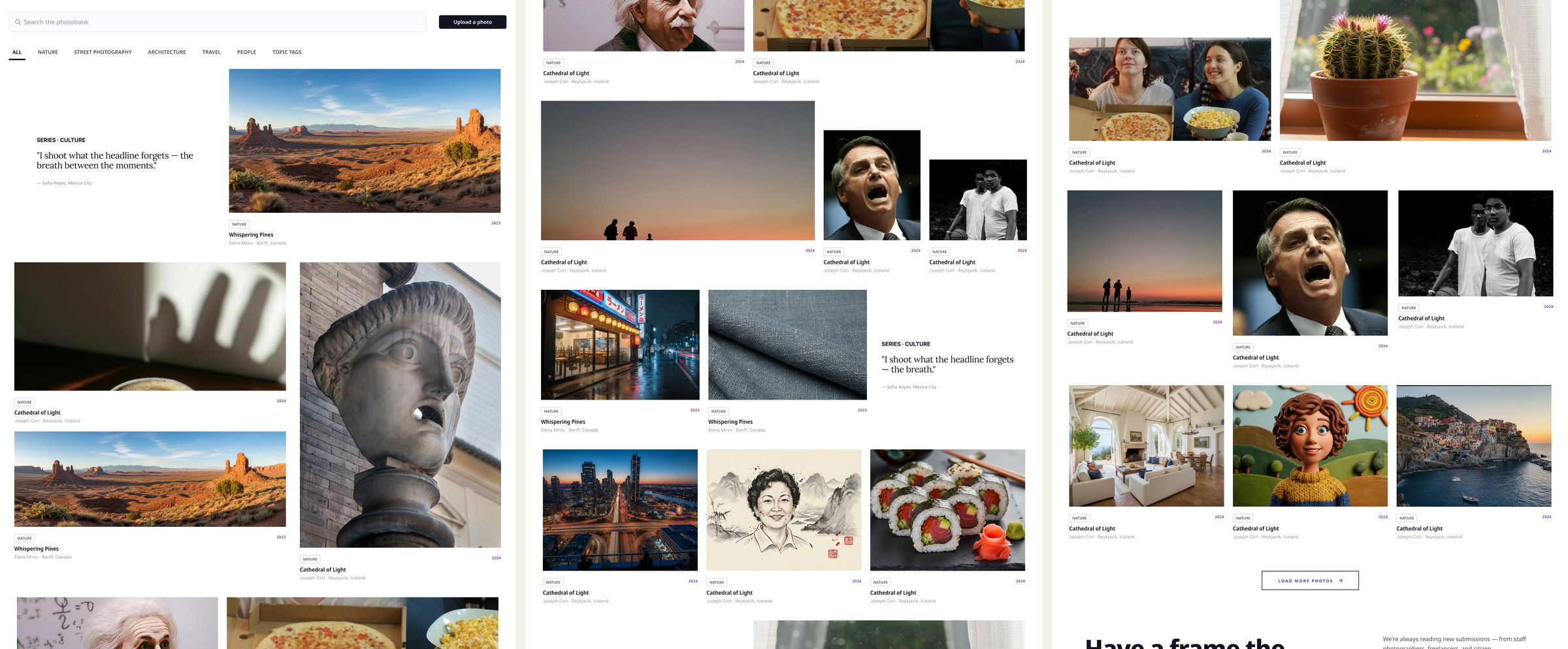
The middle ground. A featured story leads each category, the grid beneath it is tight enough to scan, and photographer credits and labels stay clear throughout. Visual and practical, balanced.
Feature 03 · Validation
I let the editors decide.
I put the shortlist in front of the editors who would use the tool every day, watched them search, and asked which layout they would rather live in.
"The balanced grid felt calm, but I could still scan it fast."
An editor, comparing the shortlist side by sideInformal and qualitative, on purpose. A handful of editors, side by side comparisons, thinking aloud as they searched. No lab, no scorecard. Enough to see a pattern, not enough to quote a percentage, so this page does not.
They consistently chose the balanced design, for three reasons in their own words: faster to scan under deadline, calmer and less cluttered, and still unmistakably editorial.
Outcomes
Done, validated, in engineering.
- Design complete. The final layout, every category section, and the search results state are finished and handed to engineering to build.
- Validated by the people who will use it. Editors chose the final layout in side by side sessions, with reasons that match the original brief: fast and editorial.
- Reusable from day one. The photo card now lives in The Sentinel's published design system, so the next gallery on the site starts from a finished component.
- Not live yet. Said plainly. A case study should be as honest as the design.
What I would do differently
Test density earlier. I would put the dense and airy versions in front of editors on day one instead of swinging fully to whitespace first; the swing taught me the problem, but a side by side would have taught it faster.
Define the measure up front. Agreeing on what "fast to scan" means, before designing, would have settled the debate with evidence instead of taste.
Componentize sooner. Building the card and category blocks as reusable components at the start would have made every iteration cheaper.