The process
How the work actually gets built.
The Sentinel is a volunteer newsroom of editors, leadership, and engineering, with me as the designer. Whether the request is a new feature, a series page, or a single component, it moves through the same four steps.
The problem behind the ask
Requests arrive in Slack from editors, the CTO, or our engineer. I dig until I understand the problem, not just the request.
Real pages, not screenshots
Options are built as live HTML previews of the actual site, so the team reacts in the browser instead of guessing from mockups.
Every state, both themes
Approved directions become Figma frames covering desktop and mobile, light and dark, empty and error states.
Handoff in writing
Each feature ships with a written spec: CSS, edge cases, and a QA checklist. Our engineer builds without me in the room.
Feature 01 · Discovery
The Archive.
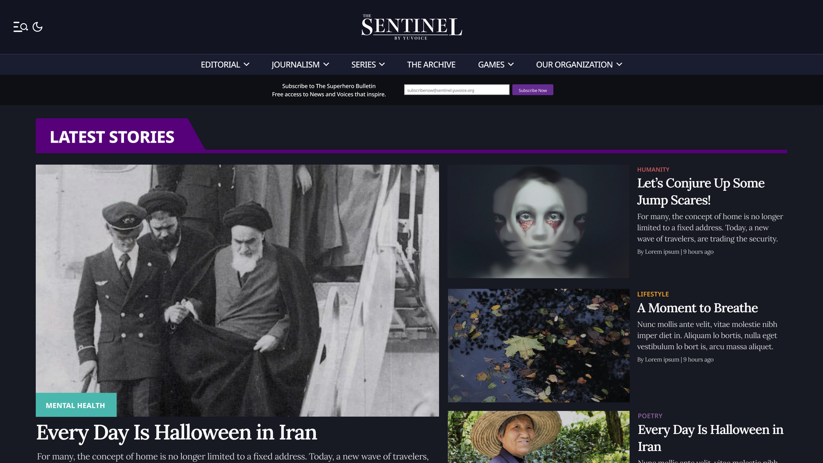
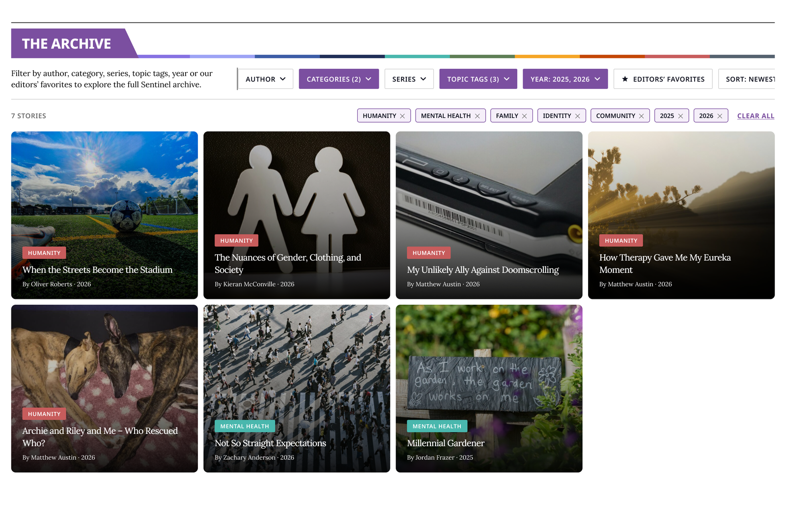
A search and filter system that lets readers explore every story The Sentinel has ever published, by author, category, series, topic, or year.
The homepage only shows the latest stories. After years of publishing, older work was effectively invisible, and the team asked for a way to "filter all stories."
Before designing any controls, I pulled the site's real tag data. It had 1,328 topic tags, and most were used only once, so a dropdown listing them all would be useless. That finding shaped the design: Topic Tags became a searchable panel that surfaces the popular tags and lets readers search for the rest.
The work, in numbers
Decisions that shaped it
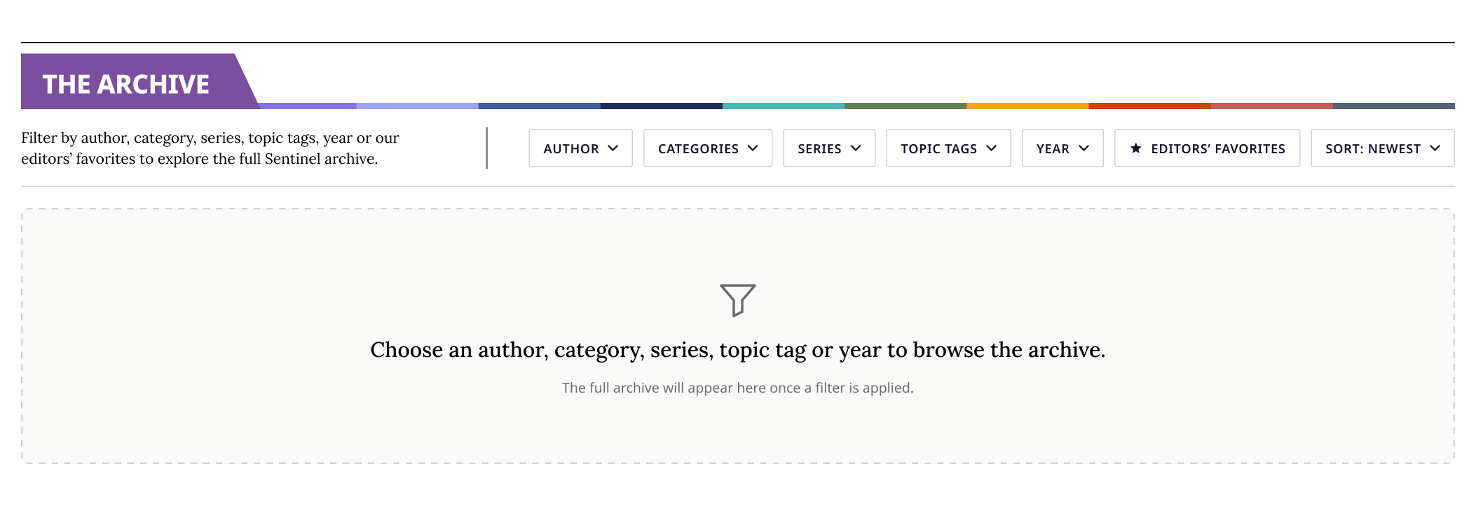
Nothing shows until a reader applies a filter. The Archive is a research tool, not a second feed, and it should never compete with the curated homepage above it.
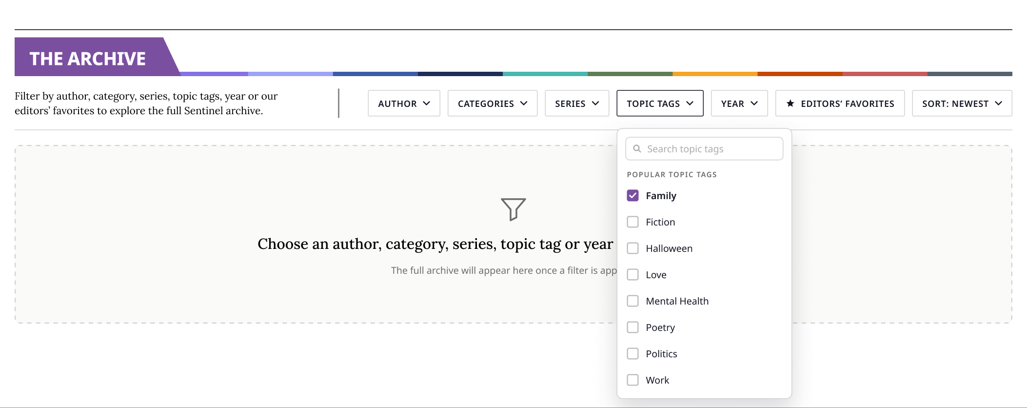
The direct result of the tag research: a searchable panel that leads with popular tags and lets readers search the long tail, instead of a dropdown of 1,328 entries.
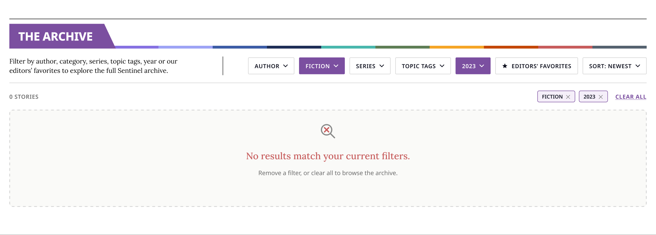
A filter combination with no stories gets its own design, distinct from a search with no matches. Its icon and copy went through three revisions of their own.
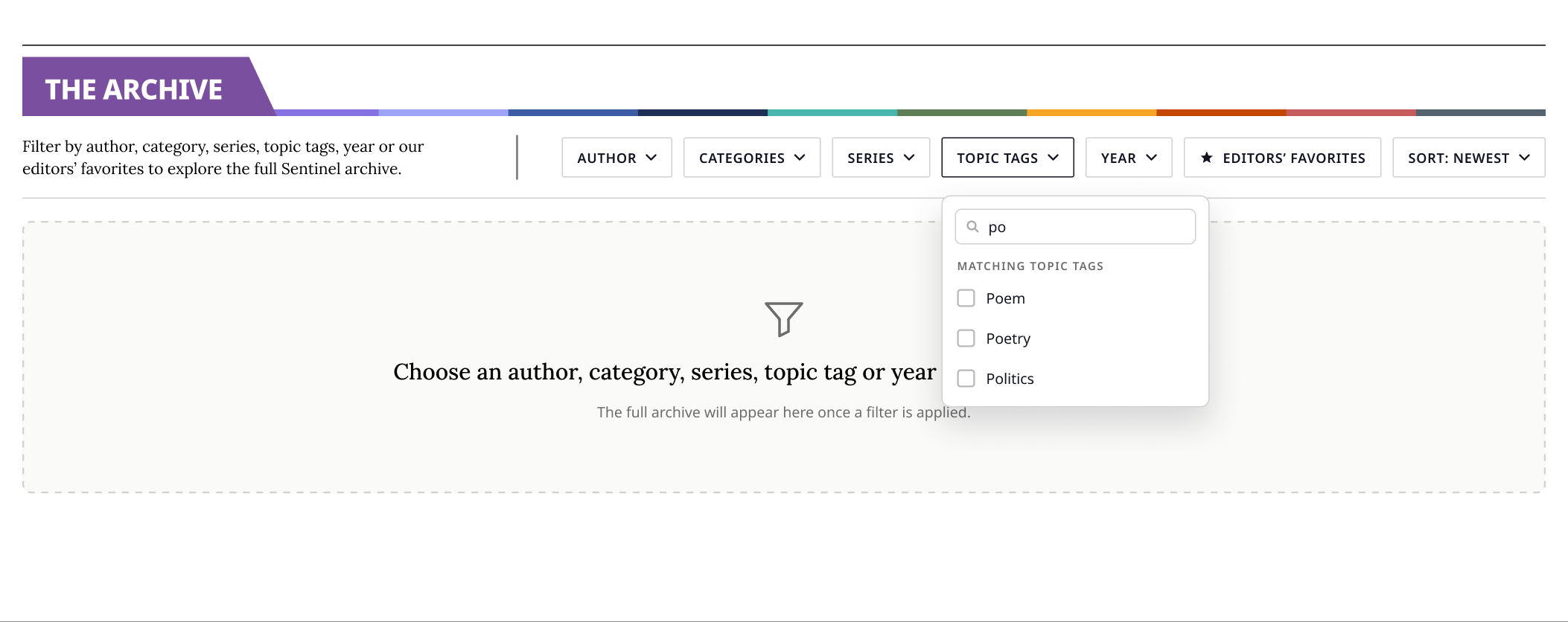
Typing filters the tag list live: "po" surfaces Poem, Poetry, Politics. A search with no matching tags is handled inside the panel itself, a different problem from a filter combination with no stories, and the two never share one message.
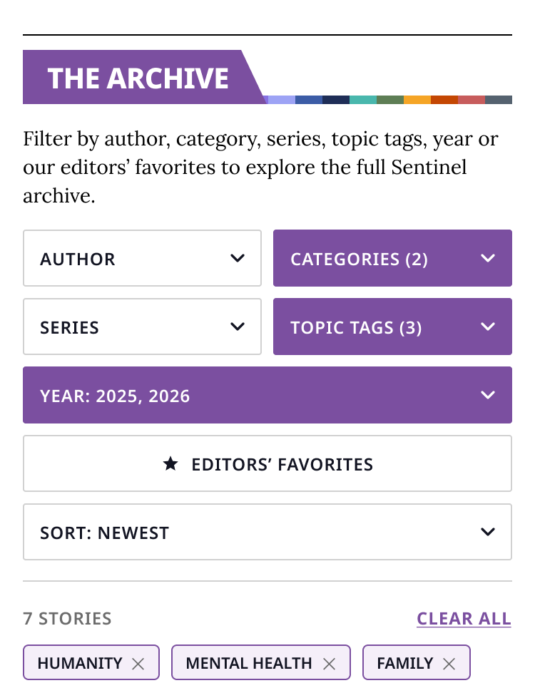
Removable filter chips. Every applied filter becomes a chip next to Clear All, so readers always see why they are looking at these results. This one was my own addition, not part of the ask.
The brand purple #560079 as the section accent. The team worried it would blur into the Latest Stories section. Their alternative, a light lavender, failed contrast with ink text. I proposed a mid violet #7B4FA0: visually distinct, and white text on it measures 6.1:1, passing WCAG AA.
The control set itself. Series was added, cut, and re-added. Author arrived in round four across all 128 frames. Round five alphabetized the final order. Each round came from the CTO's team reviews, and each is documented so we never re-litigate a closed question.
Feature 02 · Editorial voice
The pull quote.
The ask: editors wanted to repeat a powerful sentence from an article in different formatting. Crucially, they asked for a feature editors could use themselves, not a style I would apply by hand.
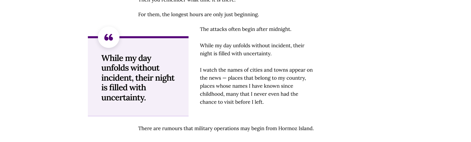
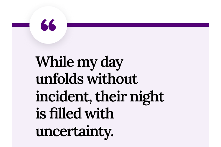
Four rounds to the right answer
Each round below is the real working preview the team reviewed, not a reconstruction. The verdicts, and the reasons, are theirs.
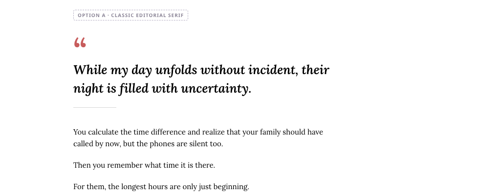
Highlight strips, angled ribbons, breakouts. The team's verdict: "not Sentinel enough, too loud." All five retired, and documented so none of them came back.
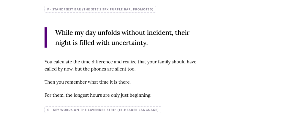
Editorial and restrained, built from the brand's own purple. Liked, but "too basic." The real tension was now clear: distinctive without being loud.
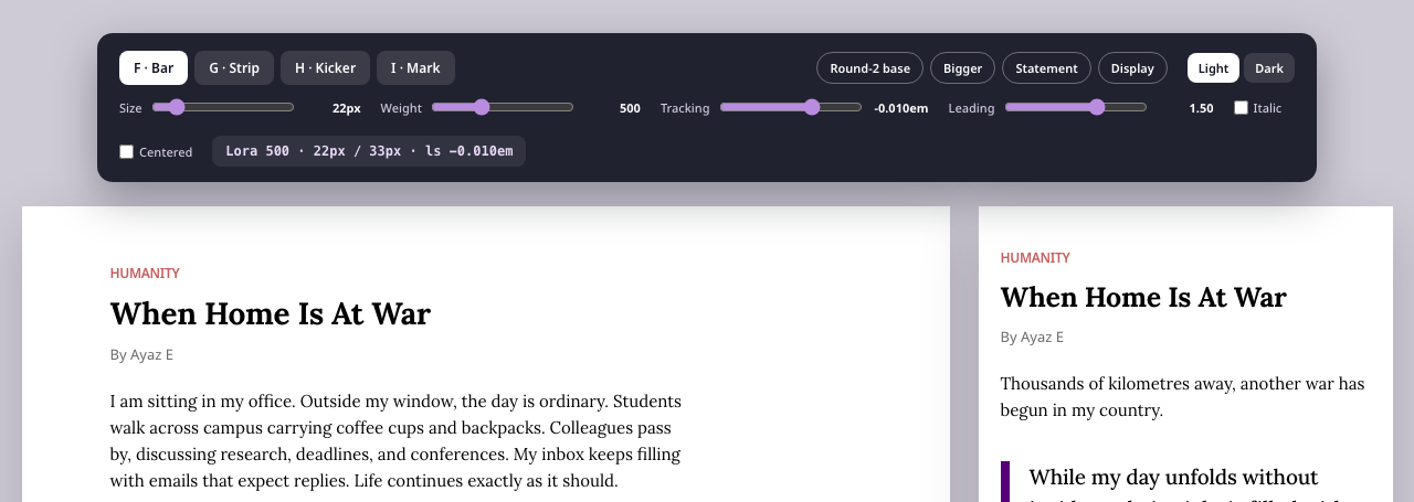
Instead of guessing sizes across another round, I built an interactive tool with sliders for size, weight, tracking, and leading. The team dialed in the typography themselves, in the real article.
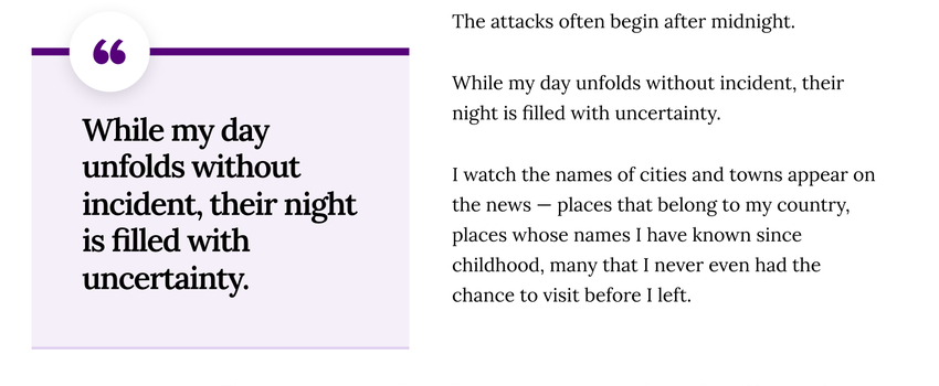
Five composed versions of the winner, with switches for color and layout. The final: a lavender slab, the brand's purple bar, a floating quote badge, and a box-left version that wraps body text.
The smartest decision was not building new tooling. The feature runs on WordPress's built-in Pullquote block, restyled to match the design, with its controls locked so it renders the same in every article. Editors got a tool they already knew, and the design cannot drift no matter who publishes.
Feature 03 · Wayfinding
Navigation, 12 desks to 5 doors.
One structure drives the desktop header, sticky bar, mobile menu, and footer, so every surface always agrees on where things live.
The nav listed every editorial desk in one flat row: twelve links, no hierarchy, and no room for anything new.
Before — Twelve destinations in a flat row

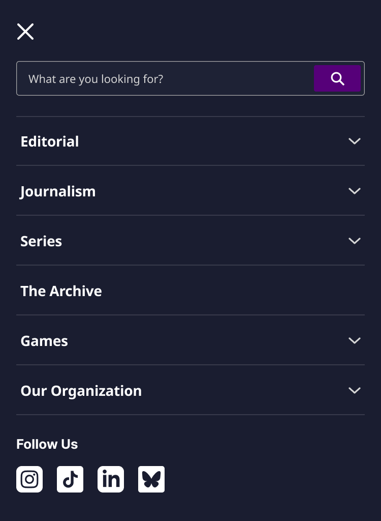
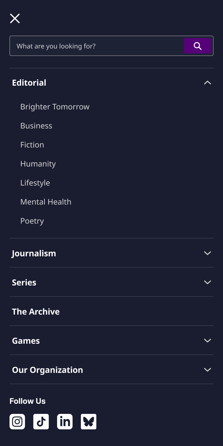
After — Five categories plus The Archive, each with a dropdown


Decisions that shaped it
Sorting twelve desks into two doors was the hardest call, and my first answer was wrong. Where does Fiction go? Is Mental Health news? My first mapping read backwards to everyone who reviewed it, so I flipped it and set a rule that ended the debate: Journalism is where readers go to learn what happened; Editorial is where they go to feel something. Every desk placement follows from that sentence, and it is written down so the next new desk gets sorted by the rule instead of by another meeting.
"You are here" took three decisions, not one. Active pages get bold text plus the brand purple. On dark surfaces that exact purple fails contrast, so it lightens to a tuned tint instead of being reused blindly. And hover stays a plain ink underline on every surface, because if hover and active looked alike, the nav would lie every time the mouse moved. A small system, but it is what keeps the desktop header, sticky bar, mobile menu, and footer feeling like one site.
The Archive earned a promotion into the navigation. It shipped as a homepage module, and I argued it belonged in the structure itself: a flat top-level item with no dropdown, because it is a destination, not a category, plus a "Browse the full archive" row anchoring the bottom of every panel. Wherever a reader is browsing, the full catalog is one click away. That is the difference between building a feature and making it findable.
Feature 04 · Infrastructure
A design system the team can trust.
A published Figma library that any new team member can open, understand, and build with on day one.
The Sentinel runs on volunteers, and volunteers rotate. A year of feature work had left components scattered across my mockups, which meant every update lived in my head and every new designer would start from zero. The challenge was not collecting components. It was building a system that survives me: one that stays updatable as the site grows, and that a stranger can navigate without a walkthrough.
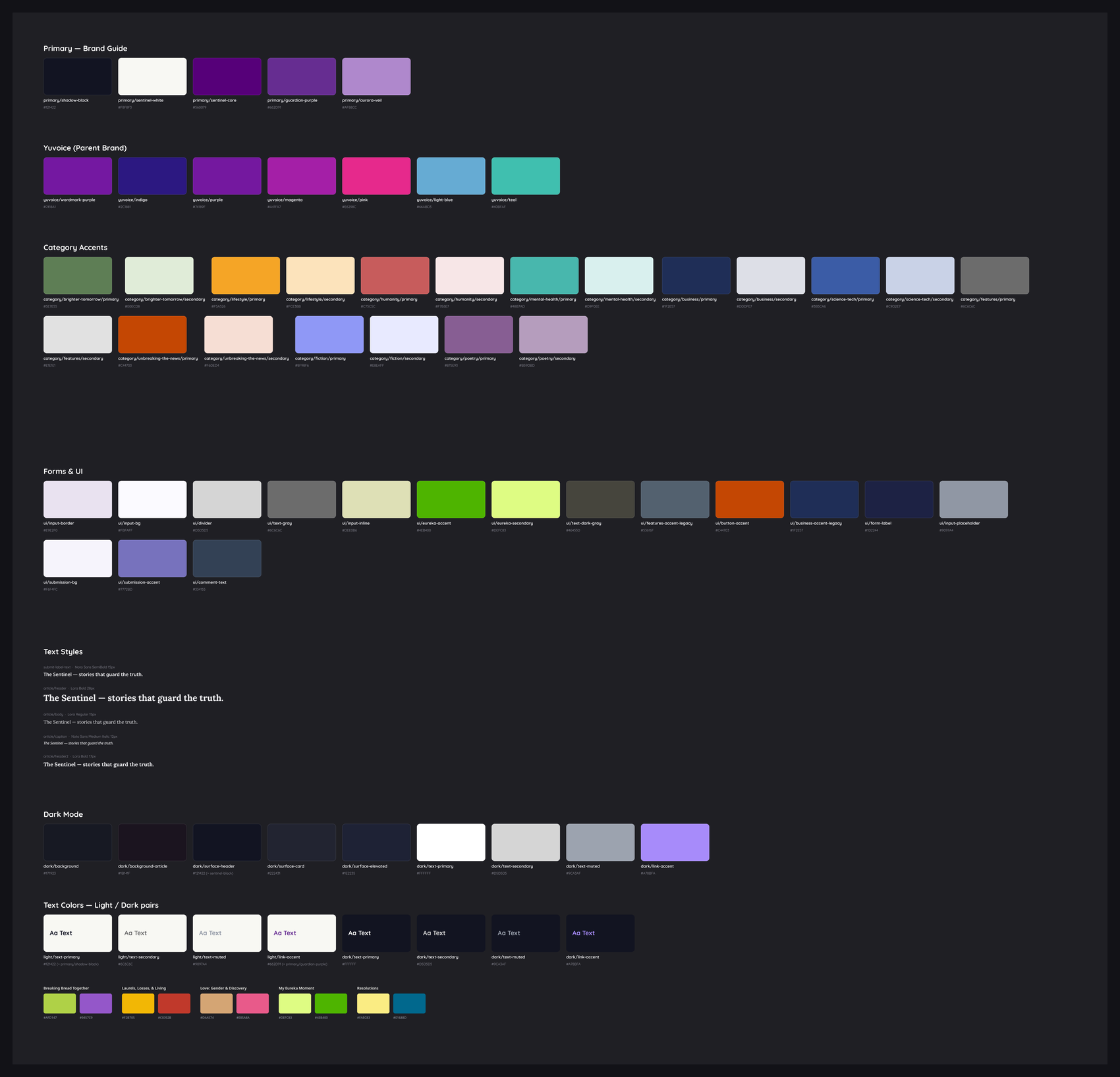
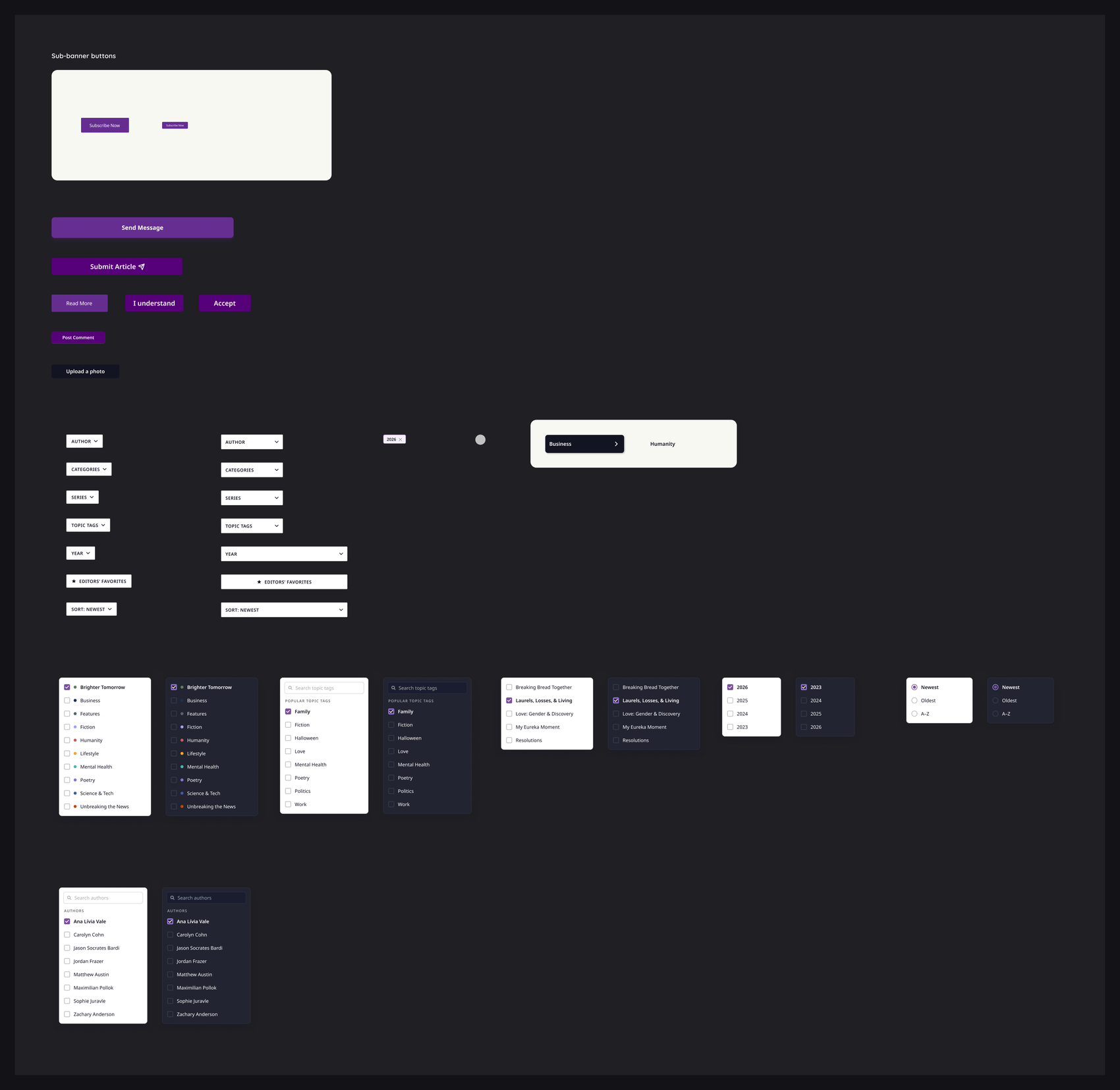
Built to be updated, not just admired. Edit the library, hit Publish, and every file gets the change. When a new story series launched, its colors, footers, and filters updated everywhere by changing the system once.
Written for the designer who joins after me. Every component says where it is used on the live site, colors carry the brand guide's own names, and intentional quirks are annotated right where a newcomer would trip on them.
Discrepancies are documented, not silently fixed. Where the file disagrees with the brand guide, the description says so; components that do not exist yet are labeled as proposals. Trust is what makes a library get used.
An editing contract on the cover. Use instances, never detach, edit here then publish, propose changes through me. Governance that fits on a sticky note actually gets followed.
Outcomes
What shipped, what changed.
Drag to see what changed


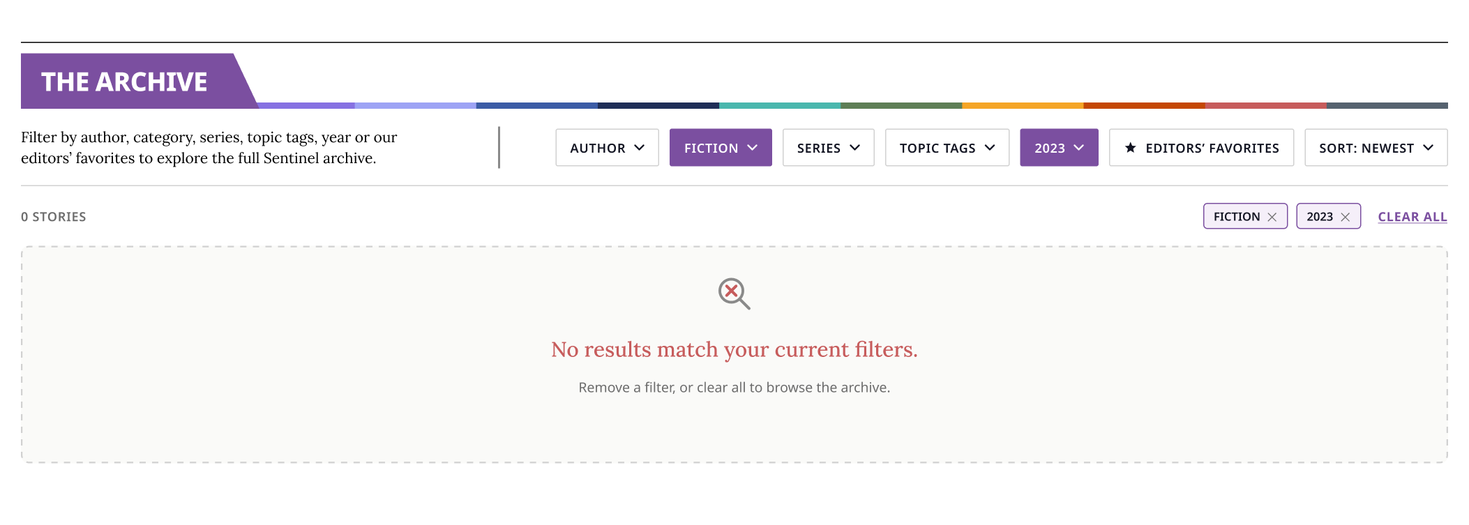
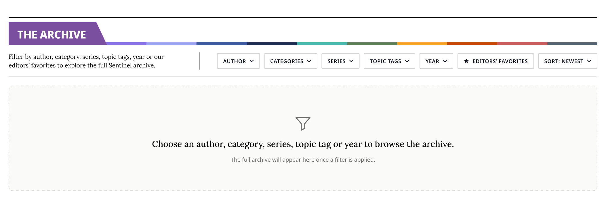
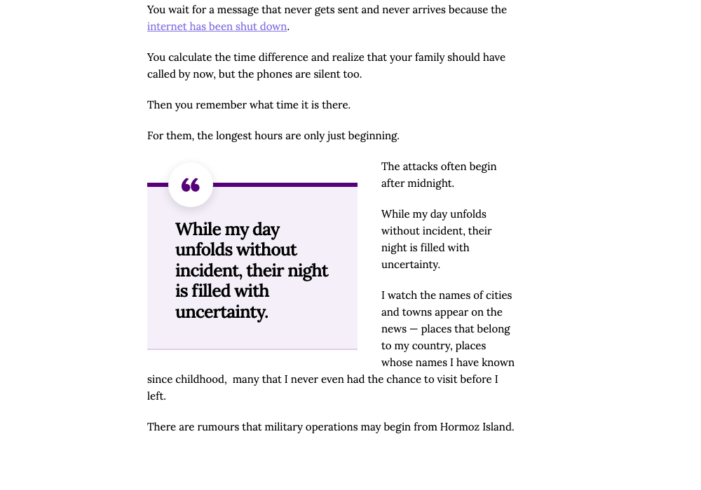
- Live in production. The navigation, Archive, and editorial features run on sentinel.yuvoice.org today, implemented by our engineer from my written specs.
- Handoffs that hold up. Specs include CSS, edge cases, and QA checklists; features have shipped without me in the implementation room.
- Accessibility as a habit. Section accents, nav states, and text colors are contrast-checked before review, and options that fail are surfaced with the numbers, not just dropped.
- A reusable foundation. New series pages now propagate through footers, menus, and filters in both files by updating the system, not by hunting mockups.
- Deadlines met. Series pages and features have consistently landed ahead of team meetings, keeping editorial launches on their calendar.
Nothing on this page is a concept project. Every feature came from a real request, went through the team, and shipped to real readers.
The short versionWhat I would do differently
I'd sit with the problem longer before designing. The pull quote took four rounds partly because I started exploring before pinning down what "feels like The Sentinel" actually meant to the team. The questions that unlocked it in round three should have been my first questions.
And I'd ground more decisions in reader behavior. The Archive's default sort, which filters lead, what the empty state says: the team and I decided those together, but they're still assumptions until real readers use them. That's the evidence I want next.